Products You May Like
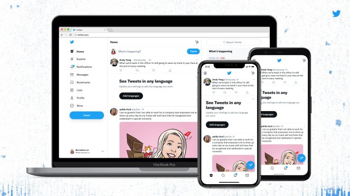
Twitter today is introducing a revamped version of its website, which the company says will make the site more accessible, less cluttered and easier to use. Among the changes, the site is implementing Twitter’s new font, “Chirp,” and it’s changing various elements to become more high-contrast, among other things. Soon, it will roll out new color palettes as well, to allow users to personalize their Twitter experience further.
Chirp was first introduced in January as Twitter’s first proprietary typeface. In the past, the company had relied on fonts like SF Pro, Roboto and Helvetica Neue for its brand. The goal with Chirp — beyond giving Twitter its own form of visual expression — was to offer a typeface that’s sharp and legible for everyday use, but also one that would allow for more personality, including when put into motion or used for brand advertising.
At the time of its debut, however, Twitter had not yet committed to making Chirp the typeface for its wider product, though the creative director for Twitter’s global brand, Derrit DeRouen, said it was his “personal desire” to do so.
Today, Twitter is making Chirp a core part of the new Twitter website.
It’s also making all Western-language text align left, which the company says will make it easier to read as you scroll. (Non-Western text is unchanged.)
The colors on Twitter.com have been updated to be more high-contrast, too, as have the buttons. One notable change is that there’s a lot less of Twitter’s blue on the site. For example, the tweets and the navigation have now shifted to black when using the default Twitter theme with the white background. And the changes to buttons — like Twitter’s “Follow” buttons, for instance — are aimed at making the most important actions stand out, notes Twitter.
These tweaks may seem minor for now, but they could become more important as Twitter rolls out its expanded feature set — like the Super Follow and other features — as they give the company a way to emphasize particular actions it wanted the user to take.
The redesign has removed some of the visual clutter on the screen, too, like what Twitter refers to as “unnecessary divider lines.” There are fewer gray backgrounds, as well as increased space to make text easier to read.
The changes prepare Twitter to make room for a different type of online experience that goes beyond just sharing text-based posts with the occasional photo or other media attached.
With Super Follow, Twitter is aiming to bring more creators onto the platform, and the company is also rolling out e-commerce shopping features, a subscription service for power users, live audio with Spaces, redesigned bookmark collections and more.
But adding features could lead to a more confusing experience, particularly for newcomers, as the new options could begin to crowd the screen. That’s why it makes sense that Twitter is redesigning its website now. However, whether Twitter users will appreciate the update remains to be seen.
The company says today’s changes are just the start of more visual updates to come, though it didn’t hint at what those future tweaks may include. It only noted that it would roll out more color palettes “soon.”