Products You May Like

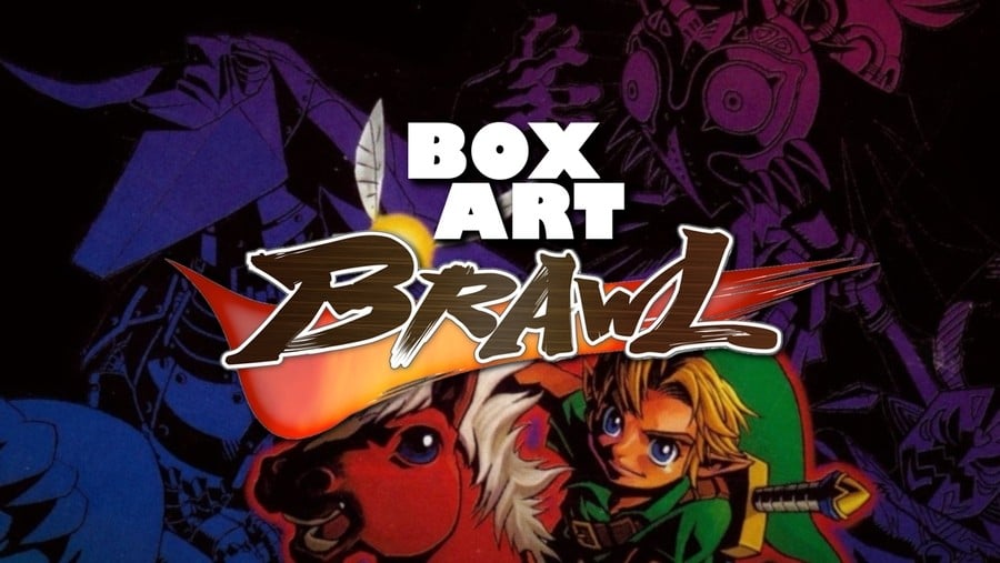
Welcome to the 41st edition of Box Art Brawl, the weekly vote to find the best of a bunch of regional box art variants from video gaming’s past.
Last week we had a blast from the past with Mega Man returning to the brawl. Perhaps as expected, the infamously poor North American cover finished in last place, although the European variant managed to oust the Japanese original from the top spot. Congratulations to Europe, although we’re sure we haven’t seen the last of Mega Man around these parts – keep an eye out for a rematch.
In the meantime we’re jumping forward to the Nintendo 64 and The Legend of Zelda: Majora’s Mask, a game which celebrated its 20th anniversary earlier this week. The Zelda series previously appeared in Box Art Brawl #9 and this game’s immediate predecessor took itself on in a close-fought battle in #27.
That’s all in the past, though. Let’s take a ride to Termina…
North America

The North American box focuses on the lovely purple logo with the titular mask replacing the Hylian shield of Ocarina of Time. The subtle little ‘Collector’s Edtion’ stone plaque sits at the bottom (the cartridge in the Collector’s Edition had a special holographic sticker) and a multicoloured aura emanates from behind the logo. On the right you’ve got the standard North American red strip and peripheral information.
The logo’s a winner in our books. The cover has impact, but the blur of colours in the background says nothing about the game. Of course, you could argue that the logo does all the talking just as it did with Ocarina. Still, with so much lovely, surreal key art available it’s perhaps a shame that this cover didn’t highlight some of the game’s oddness.
Europe

The European version takes the same logo and puts it on a rich green background. If you look quickly, it’s easy to miss that the background shows the key art of Termina and its inhabitants, with Young Link on horseback holding the Zora mask.
The subtle gold highlights in the Nintendo 64 logo outline and the ‘PAL Version’ at the bottom work beautifully against the green, as does the purple of the title. By this time in the system’s life Nintendo of Europe had given up on the black borders and this game certainly benefits.
Japan

Finally, the Japanese box got another piece of art with Link and Epona above a collection of figures–bosses, mask transformations and even the Happy Mask Salesman–rendered over a spectrum of colour. The logo is present and correct, although it’s smaller and gets a little lost in the colour beneath Link and his cute steed. We like how evocative of the game it is, although the richness of the European cover and the boldness of the large logo probably just edges our personal vote. You’re the ones with the power, though.
Bonus!
This week we’ve got two bonuses for you! In Japan the box above came in a bigger box which included the required Expansion Pak (there was also a separate cart-only release of the game which used the same image as below but put a big ugly red strip along the bottom):

And as another little bonus, here’s what Nintendo went with for the 3DS release of the game, The Legend of Zelda: Majora’s Mask 3D:

And there we are! They’ve all got their pluses, but it’s the minuses that’ll decide this round. Click your favourite and hit the ‘Vote’ button…
Let us know below what you (dis)like about each of the candidates this week, and we’ll catch you next time on Box Art Brawl.
